Global Payments
bold identity, human tone

100%
compliance
Context
We collaborated directly with the Global Payments team, one of the leading providers of financial transaction solutions worldwide.

Challenge
The main challenge was to develop a visual identity that could stand out in the finance & banking sector while balancing friendliness and seriousness. The client didn’t want a look that felt too rigid or overly cheerful — the goal was a professional yet human tone that inspires trust and remains approachable.

No items found.
Solution
No items found.
Process
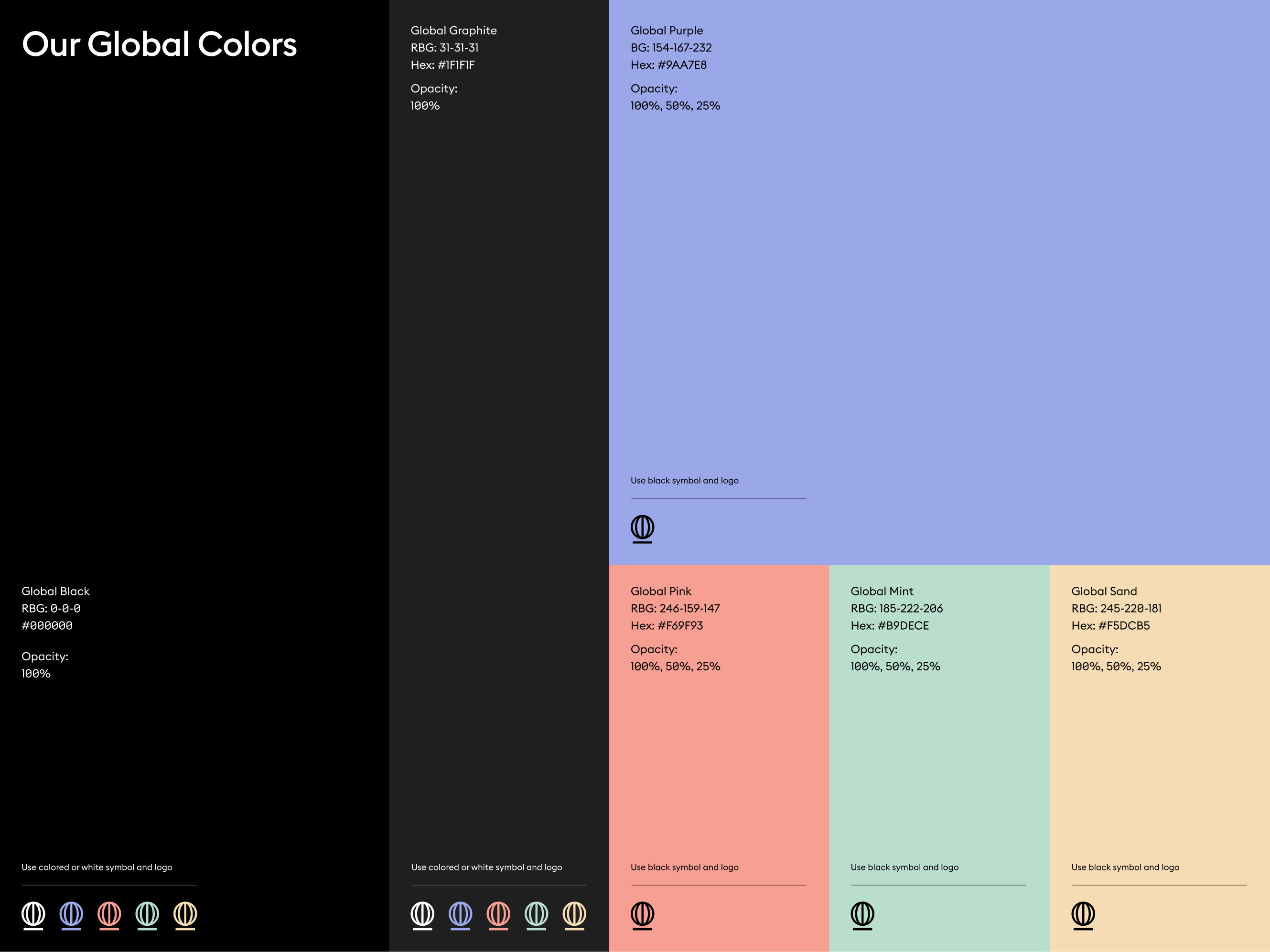
We carried out a full cycle: competitor analysis, moodboards, and semantic mapping with the client, followed by sketches and iterative feedback sessions. The final expressive solution combined a rotating coin and a globe, supported by bold type, soft illustrations, and pastel accents to balance professionalism with warmth.


No items found.
Feedback
“The new identity perfectly captures the essence of our business—clarity, speed, and trust. It’s modern and scalable, just like our solutions. We’re proud to present this brand to partners and clients worldwide.”
Ekaterina Mazovka
Senior Payments Manager

Additional work
.png)